

In education, data is EVERYWHERE. And where there is data, there is the lurking expectation that it will be used. Regularly. And in a manner that provides demonstrable impact.
But the mere presence of data does not ensure impact. As we have argued previously, data is not the solution. In fact, data has no real utility at all until it is interpreted, transformed into actionable information and acted upon.
So what’s the problem here? Let’s just collect and use the right kinds of data!
Unfortunately, whilst collecting and using data effectively plays a role in school improvement, not all data is equal. This assumption can create a dangerous catch-22 for educators who may well find themselves in a bind.
I will unpack the many problems that arise from incorrect uses of data in future blogs, but for now, I am going to focus on what I consider to be one of the most fundamental challenges around the use of data in schools- a lack of preparedness. Indeed, teachers are often being asked, without effective preparation, to navigate The Good, The Bad and The Ugly of educational data.
What do I mean by this? Well let’s start at the end and work back - otherwise you wont read the whole blog.
The Ugly.
There are many ways to report data effectively. Ideally, good presentation facilitates interpretation and understanding. Unfortunately, research suggests that in education, we are not too good at reporting effectively (although we might be getting better).
Pie charts and radar charts are both examples of strategies that while visually appealing, have been shown empirically to be poorly understood. That means that people don’t really understand what they are looking at. Check out the below image and take a few moments to digest.

The colours are fantastic, right? But what is the chart really telling us? And, is there a more effective way to report the data?
Another classic example of the The Ugly are the league style tables that are reported annually to allow the public to compare the ‘performance’ schools.
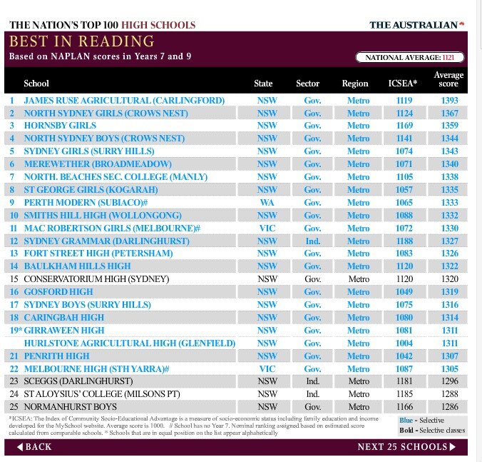
Sigh. These typical tables unfortunately misrepresent the data and create public confusion (see a couple of post I have mad about this in the past on LinkedIN and Pursuit). Disconcertingly, these representations of data also fail to esteem those schools doing an outstanding job of impacting upon the learning of their students.
The lessons here is really that if we are going to report data to an audience to use we need to make sure it meaningfully conveys the intended message. If it is appealing that is a bonus.
The Bad.
In education, there are many forms of data we use because “it’s always been this way”. But although we inherently prefer to go with what we know, does not mean that we are looking at the right data -or that the data we collect and present is actually fit for purpose.
Percentages, for example, are a terrible form of data that actually convey very little meaning other than what proportion of questions were answered correctly on an assessment. Percentages actually convey nothing meaningful about what a student knows or can do. They also don’t tell us where the student has come from, or where they are going.
Other what tell you what proportion of questions on a test answered correctly what does 90% on a test actually mean? Does it tell you how hard the questions were?
Oh yes, we LOVE talking about percentages in education. They are incredibly appealing. But they can be dangerous… particularly when we do things like provide percentages across assessments of varying difficulty. That’s when we actually pollute the very limited information they convey. Grrr. It makes me frustrated! Fortunately there are numerous alternatives available for us to use (which we will explore in future posts).
The Good.
When we talk about good forms of data representation, we are talking about data which has purpose, is easily understood, and leads to action. The idea of data with purpose is actually something I am quite passionate about. My PhD was focused on Effective Score Reporting, and the general gist of my view is that if we are going to go the trouble of collecting data, we need to make sure that how it is reported works. That is, that data use ensures that the cognitive load of those using it is spent thinking through how to use the data as opposed to figuring what it actually means. The Good then is data which is timely, meaningful, interpretable and actionable. Examples of such includes scaled scores (from some standardised assessment) linked to a development progression, developmental assessment rubrics, and rich formative classroom based assessment strategies.
Over the next few weeks, we are going to delve a little deeper into the good and bad of educational data, and really explore what makes some of our current practices so bad…. and how we can get the best out of the good.
If you have not already subscribed to our newsletter sign up at the bottom of the page!
Tim O’Leary